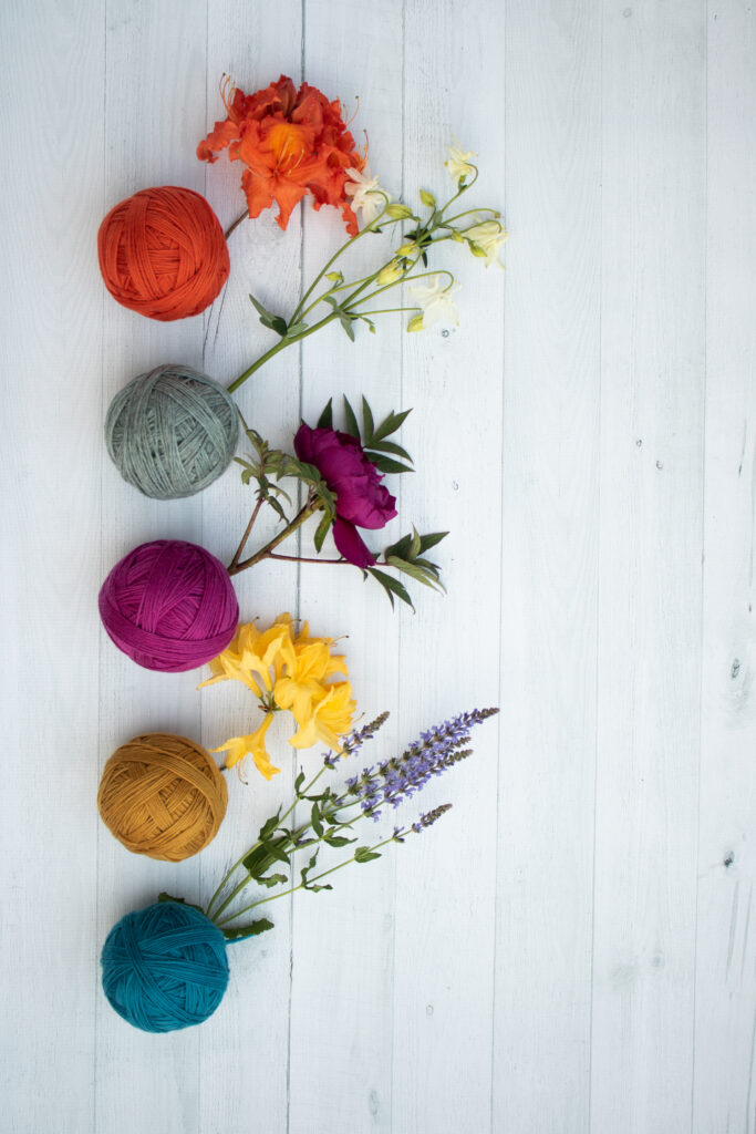
As knitters, we have such a wonderful array of colorful yarn to work with.
But color can be a complex subject, with a mind-boggling amount of theory and science behind it. When we’re combining yarns for a multi-color project, all those beautifully colorful yarns in our stash can suddenly become a bit scary. The fear of selecting the ‘wrong’ colors sets in, and we find ourselves avoiding projects with multiple colors.
We never want you to be afraid to try new things with your knitting, so today we’re sharing some basics of color theory; you can find more information on our color theory page in the Reference section of your Knitter’s Planner
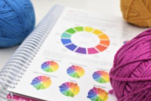
First, a few definitions:
Hues- The purest form of a color. This is the rainbow with no white, greys, or blacks added in.
Tint- A Hue + white. Think of lovely spring pastels.
Tone- A hue + grey. Adding grey decreases the intensity of a color.
Shade- A hue + black. Think of beautiful, deep jewel colors.
Contrast- The perceived difference between colors in a design. Contrast is what makes a color combination interesting.
Primary Colors- These colors cannot be created by mixing other colors. There are three primary colors: red, blue and yellow.
Secondary Colors- Colors created when mixing 2 primary colors together. These are green, orange and purple.
Tertiary colors- Colors created when combining a primary color with an adjacent secondary color. Red-orange, yellow-orange, yellow-green, etc.
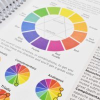
Now that you have a good color vocabulary, here are a few fun combinations to try the next time you have a pattern that calls for two or more colors of yarn.
Complimentary- Hues across from each other on the color wheel have the most contrast between them. Those are your complementary hues. When they are next to each other, complementary hues boost their opposite color to its maximum potency. Instead of doing the expected complimentary color combination with a primary color and a secondary color (blue and orange, for example), try playing with some tertiary compliments. Try yellow-green with red-violet, or yellow-orange with a blue-violet.
Analogous- These are colors that are next to one another on the color wheel. For example, orange, yellow-orange and yellow. Projects with an analogous combination can evoke feelings of harmony and balance.
Monochromatic- Pick one hue and select yarns in that hue with varying shades, tones, or tints.
Near complementary- Instead of going straight across the color wheel, go across and one over for an unexpected color combination. Blue and red-orange, or yellow and blue-violet. These combinations soften the look of a traditional complementary color combination.
Pantone Color of the Year
Need more color inspiration?
The leading authority on color is Pantone. Every year they release a color of the year, and we thought we’d share more about the color chosen for 2022.
Very Peri
17-3938
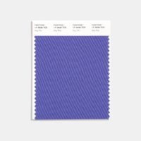
This is what Pantone said about why they picked this shade:

We hope this quick dip into color theory helps you the next time you’re selecting yarn combinations. Above all, it’s important to remember that we all see color differently and although color theory is good to know, it’s also ok to go with your instinct!
I would love if you would make these pages a downloadable purchase